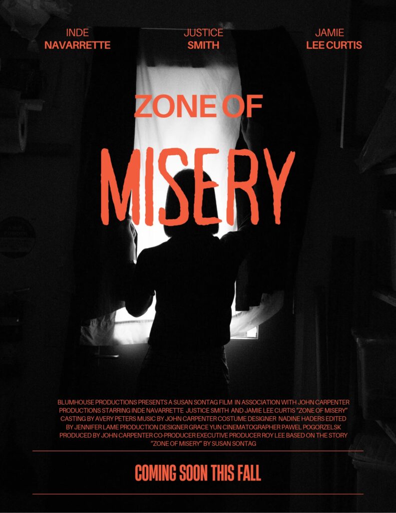
The phrase that was chosen for the movie poster was, “Zone of Misery” from Susan Sontag’s book On Photography. For additional context, the full quote is “A photograph that brings news of some unsuspected zone of misery cannot make a dent in public opinion unless there is an appropriate context of feeling and attitude” (Sontag, 17). This phrase was chosen because Sontag makes the compelling claim that any form of suffering depicted in a photograph brings visibility to those who have suffered. While the photos may not always move the audience, there needs to be context of feeling and attitude to shed light on the victims.
In this movie poster, my goal was to make the audience feel extremely uncomfortable and bring that aspect of horror to the screen. Horror movies provide a sense of empathy to the victims especially when they stem from real scenarios. This helps to make the audience become more emotionally aware. By bringing this awareness, it immerses the audience and grasps the reality of those who have suffered. The photos come from real events that have taken place, which only makes it more unsettling. The horror genre can also help to build a community which forms connections and bonds with others.
I wanted to make sure the typography that was used emphasized the word “misery”. This word helps to create context about what the movie is about. It was important to me that the title had an eerie effect to make it known that this movie would be a horror movie. In terms of the color, I decided on the color red since the background is dark, and it popped out to the viewers. “Misery” is bigger than the other words because I want that to be the first word the audience views.